傑作展廳 The Exhibition Hall
每一張海報都是經過演算法驗證的視覺武器 Every poster is an algorithm-validated visual weapon
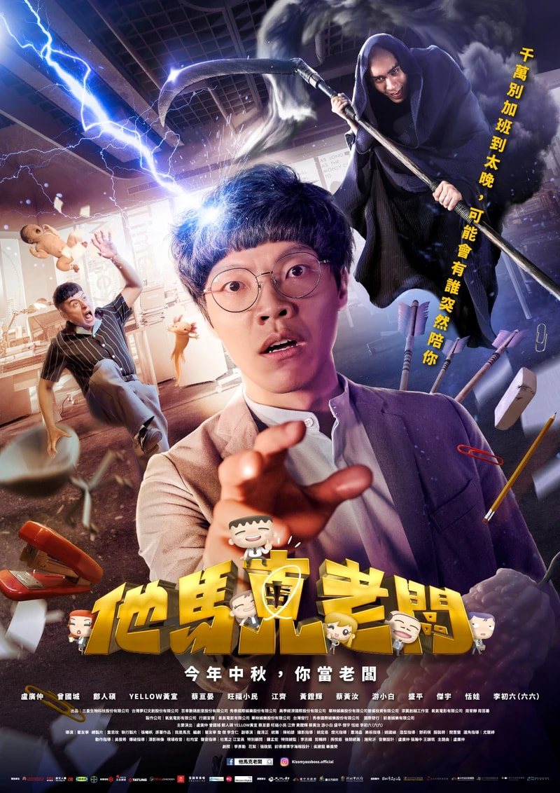
他馬克老闆
氧氣電影 / 2023
他馬克老闆
2023
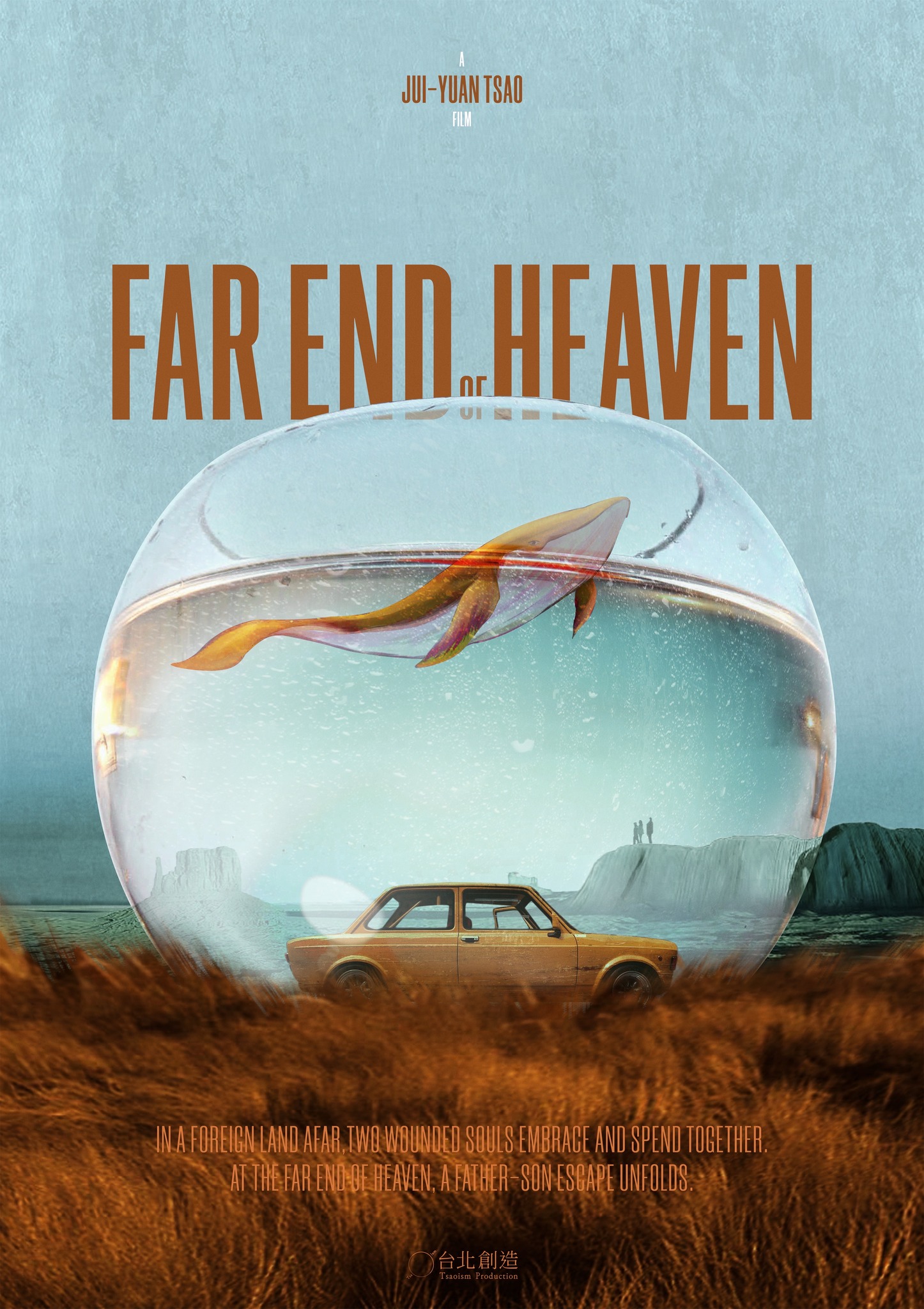
天堂的邊緣
台北創造 TSAOism / PixelFrame / 2025
天堂的邊緣
2025
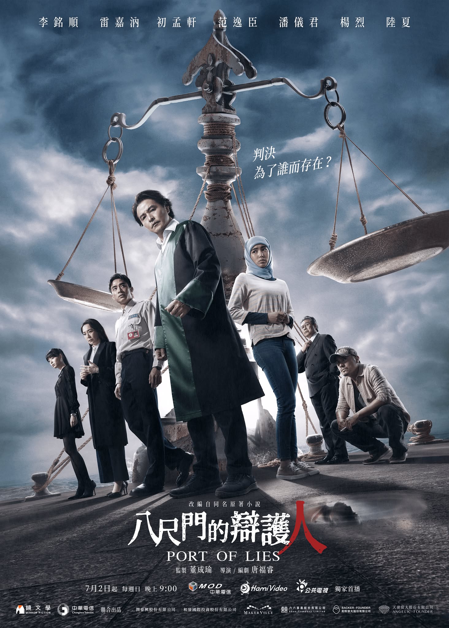
八尺門的辯護人
鏡文學 / 中華電信 / 2023
八尺門的辯護人
2023
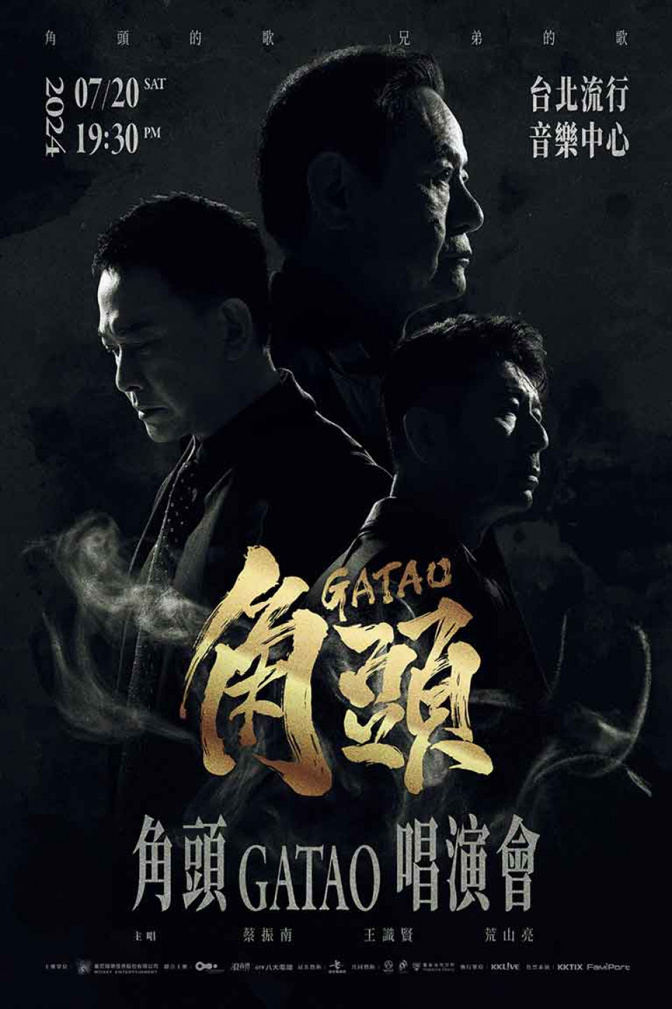
角頭演唱會
曼尼娛樂 / 2024
角頭演唱會
2024
有生之年
TVBS / Netflix / 2023
有生之年
2023
化外之醫
公視 / 愛奇藝 / CATCHPLAY+ / 2025
化外之醫
2025
星空下的黑潮島嶼
客家電視台 / Hami Video / 2025
星空下的黑潮島嶼
2025
老翅膀
陳小霞 / 2025
老翅膀
2025
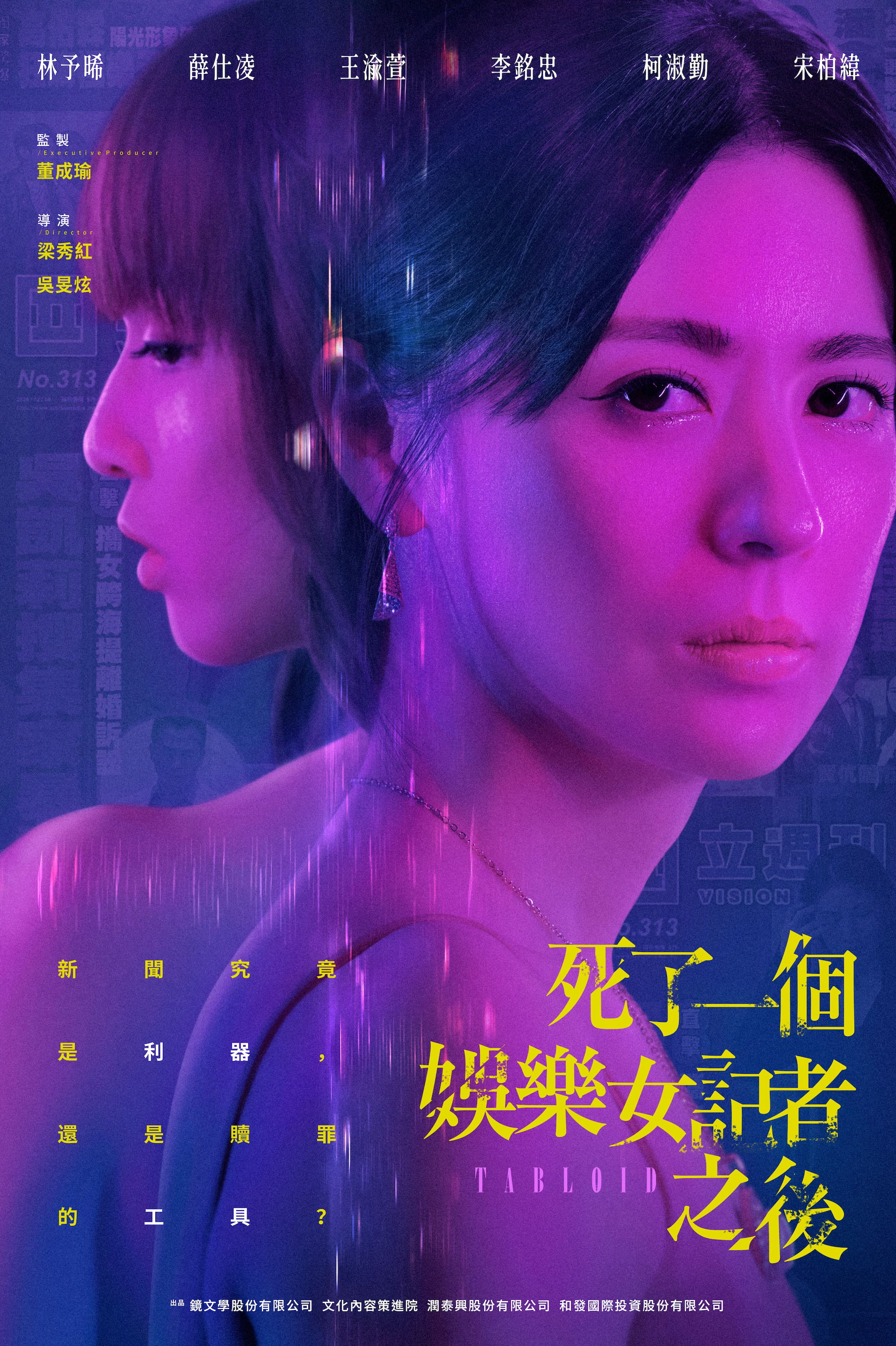
死了一個娛樂女記者之後
公視 / Netflix / 2025
死了一個娛樂女記者之後
2025

K-DOL 愛心增加學院
台灣原創 / 2024
K-DOL 愛心增加學院
2024
影后
Netflix / 台灣大哥大 / 2024
影后
2024
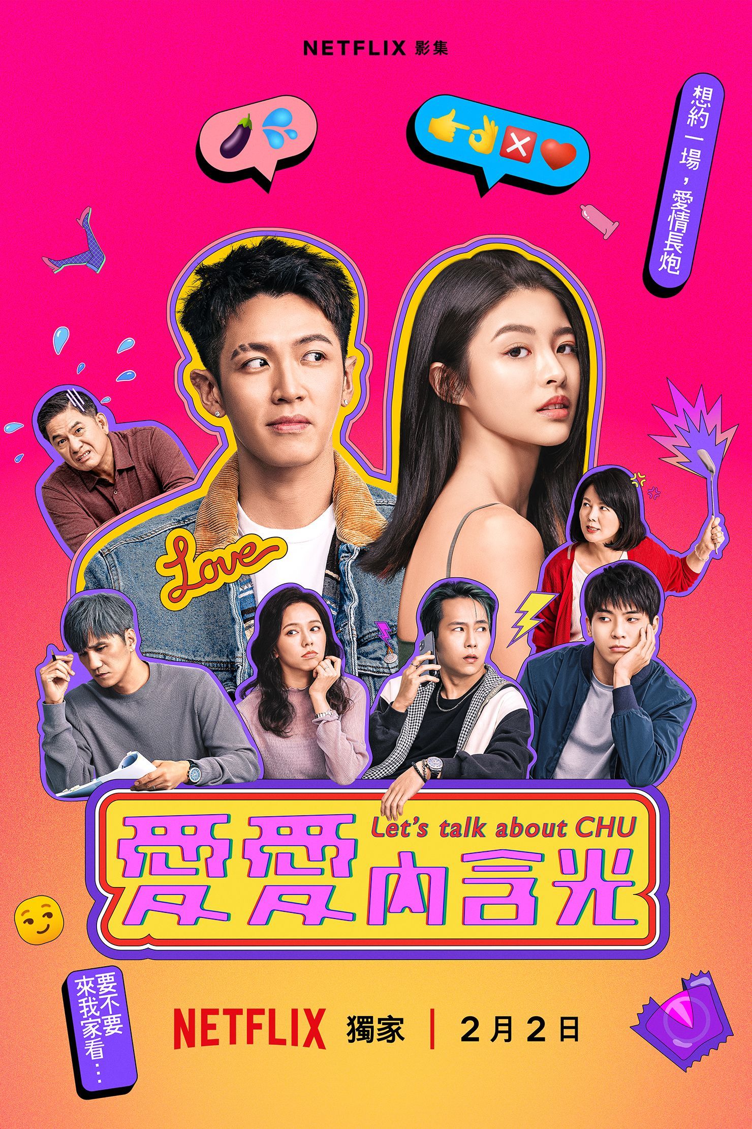
愛愛內含光
Netflix / 2024
愛愛內含光
2024
模仿犯
Netflix / 2023
模仿犯
2023
誰是被害者2
瀚草影視 / Netflix / 2024
誰是被害者2
2024
正港分局
金盞花大影業 / Netflix / 2024
正港分局
2024
疫起
台灣電影 / 2023
疫起
2023
My Boss Mark
Oxygen Films / 2023
My Boss Mark
2023
Far End of Heaven
TSAOism / PixelFrame / 2025
Far End of Heaven
2025
Port of Lies
Mirror Fiction / Chunghwa Telecom / 2023
Port of Lies
2023
GATAO Concert
Mani Entertainment / 2024
GATAO Concert
2024
Living
TVBS / Netflix / 2023
Living
2023
The Outlaw Doctor
PTS / iQIYI / CATCHPLAY+ / 2025
The Outlaw Doctor
2025
Black Tide Island
Hakka TV / Hami Video / 2025
Black Tide Island
2025
Old Wings
Chen Xiao-Xia / 2025
Old Wings
2025
Tabloid
PTS / Netflix / 2025
Tabloid
2025
K-DOL Academy
Taiwan Original / 2024
K-DOL Academy
2024
Born for the Spotlight
Netflix / Taiwan Mobile / 2024
Born for the Spotlight
2024
Let's Talk About CHU
Netflix / 2024
Let's Talk About CHU
2024
Copycat Killer
Netflix / 2023
Copycat Killer
2023
The Victims' Game 2
Greener Grass Production / Netflix / 2024
The Victims' Game 2
2024
Copycat Killer Precinct
Greener Grass Production / Netflix / 2024
Copycat Killer Precinct
2024
Eye of the Storm
Taiwan Film / 2023
Eye of the Storm
2023
他馬克老闆
氧氣電影
改編自連載14年的人氣網漫《我是馬克》,首次真人電影化。瞿友寧導演睽違5年再度與三金天王盧廣仲合作,加上金曲歌手黃宣 YELLOW 首次吃重戲份演出。以集體創作方式打造台灣久違的喜劇片型,一展社畜厭世心情大暴走。
成效數據
天堂的邊緣
台北創造 TSAOism / PixelFrame
曹瑞原導演籌備17年的心血之作。2006年獲「國際影視創投會」評審團特別獎,歷經導演母親病逝的人生轉折,終於即將完成。「越是荒蕪,越要勇敢造夢」——一段父子曠野逃亡的旅程。臺澳合製的跨國製作規格,以荒漠與星空的視覺意象,呈現生命中的失落與救贖。
成效數據
八尺門的辯護人
鏡文學 / 中華電信
探討原住民、移工、死刑與官商勾結的法律政治驚悚劇主視覺。以法庭天秤與漁港意象交織,呈現「正義vs體制」的核心張力。冷灰藍調營造壓迫感,人物背影構圖暗示孤獨對抗體制的無力與堅持。
成效數據
角頭演唱會
曼尼娛樂
《角頭》系列電影十週年紀念演唱會主視覺。以江湖兄弟情義為核心,融合霓虹燈管與刺青美學,呈現「黑道浪漫」的獨特風格。紅黑金三色對比強化衝突感,人物群像構圖致敬電影經典場景。
成效數據
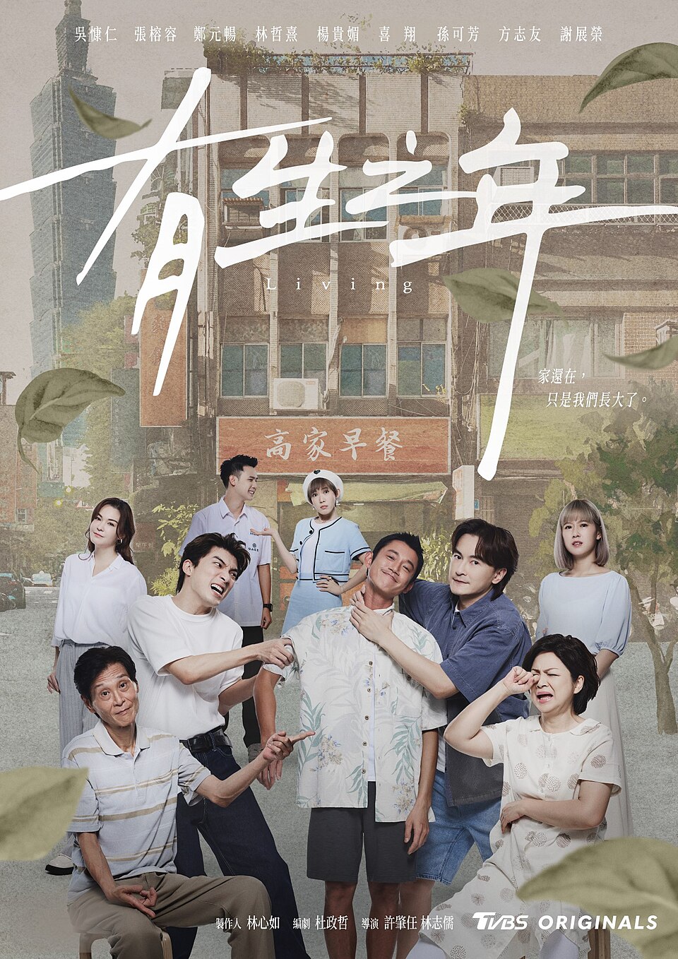
有生之年
TVBS / Netflix
探討家庭關係與生命意義的溫情劇主視覺。以家族群像與溫暖光線構圖,呈現「在有限生命中尋找連結」的主題。柔和色調與日常場景營造親切感,視覺策略降低觀看門檻,引發觀眾對家庭關係的共鳴與反思。
成效數據
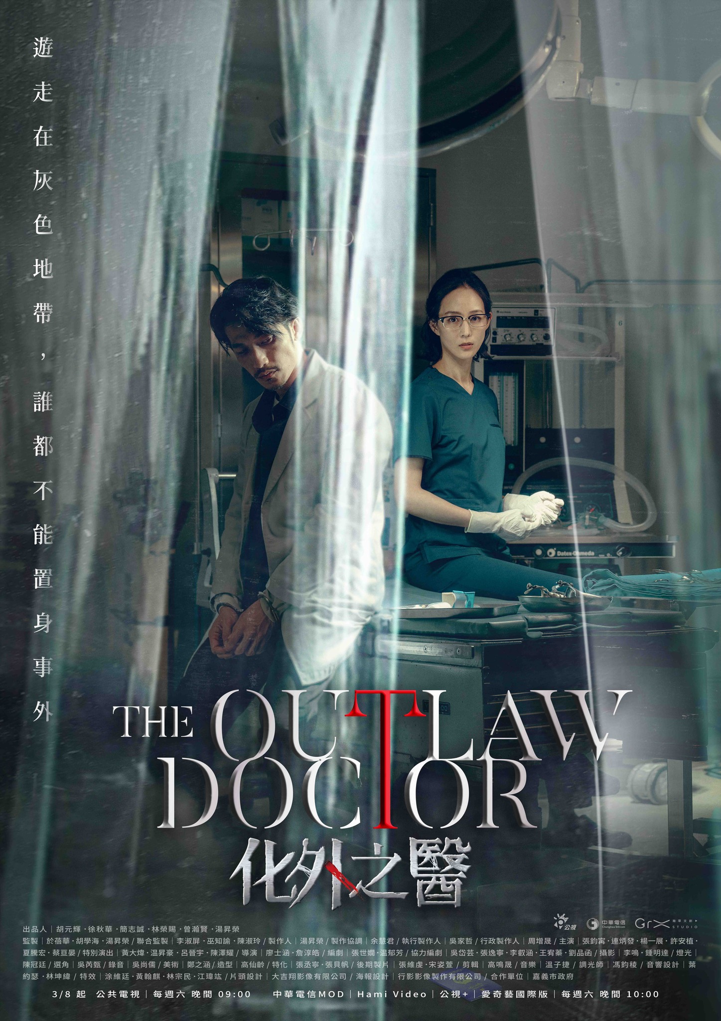
化外之醫
公視 / 愛奇藝 / CATCHPLAY+
探討外籍移工與醫療體系困境的社會寫實劇主視覺。以手術燈光與陰暗地下室的光影對比,呈現「檯面上vs地下」的雙重世界。醫療器械與越南文化元素交織,視覺語言傳達身份認同與生存掙扎的張力。
成效數據
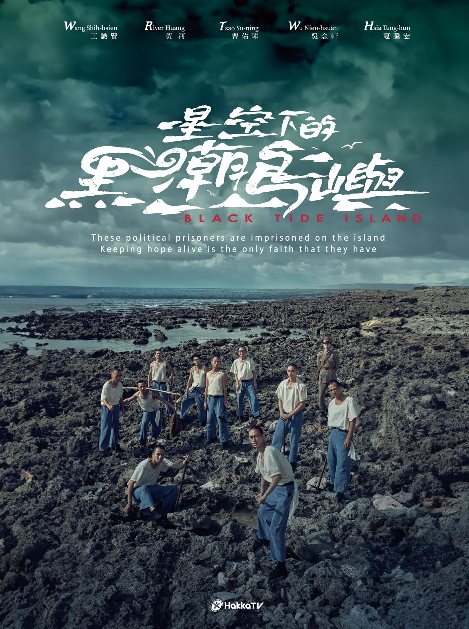
星空下的黑潮島嶼
客家電視台 / Hami Video
重現白色恐怖時期綠島新生訓導處的時代劇主視覺。以星空與黑潮海洋為背景,人物剪影佇立於島嶼礁石上,傳達「黑暗中仰望希望」的意象。冷峻藍黑色調搭配微光星點,營造歷史厚重感與人性光輝的對比。
成效數據
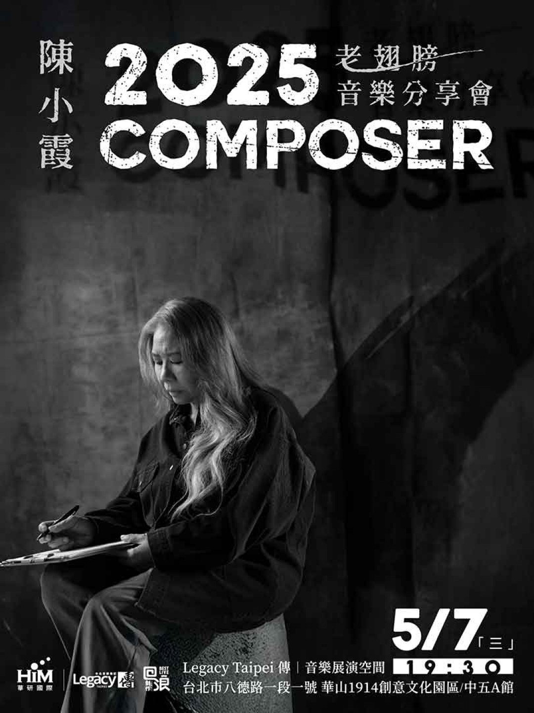
老翅膀
陳小霞
華語樂壇創作職人陳小霞睽違20年個人專輯封面設計。以極簡留白與手繪羽毛意象,呈現「老翅膀依然能飛」的核心概念。溫暖大地色調傳遞歲月沉澱的智慧,構圖留下呼吸空間,呼應專輯「放下包袱、重新起飛」的生命哲學。
成效數據
死了一個娛樂女記者之後
公視 / Netflix
探討媒體生態與真相追尋的懸疑犯罪劇主視覺。以破碎的相機鏡頭與八卦雜誌拼貼構圖,暗示「誰殺了真相」的核心命題。紅黑報紙標題風格強化聳動感,人物剪影與閃光燈特效營造狗仔追逐的緊張氛圍。
成效數據
K-DOL 愛心增加學院
台灣原創
偶像養成校園劇主視覺。以霓虹燈光與舞台元素構圖,呈現「數字決定地位」的競爭氛圍。粉紫色系搭配星光特效,精準鎖定Z世代受眾。角色群像排列暗示人物關係張力,視覺語言融合K-POP美學與台灣在地青春感。
成效數據
影后
Netflix / 台灣大哥大
聚焦女演員演藝圈生存的寫實喜劇主視覺。以舞台聚光燈與鏡面反射構圖,暗示「台前光鮮vs幕後真實」的雙重敘事。金色與黑色的對比象徵名利與代價,群像構圖展現女性力量與競爭張力。
成效數據
愛愛內含光
Netflix
大膽挑戰華語市場禁忌題材的性喜劇主視覺。以鮮豔糖果色系與俏皮插畫風格,消解性議題的尷尬感。家庭群像構圖暗示「跨世代對話」主題,視覺策略精準降低觀眾心理門檻,提升點擊意願。
成效數據
模仿犯
Netflix
改編自宮部美幸同名推理小說的台灣在地化詮釋。以90年代台灣社會為背景,主視覺運用報紙拼貼與VHS質感,重現媒體亂象時代的視覺語彙。紅黑對比色調暗示血腥與黑暗,人物剪影構圖營造懸疑感。
成效數據
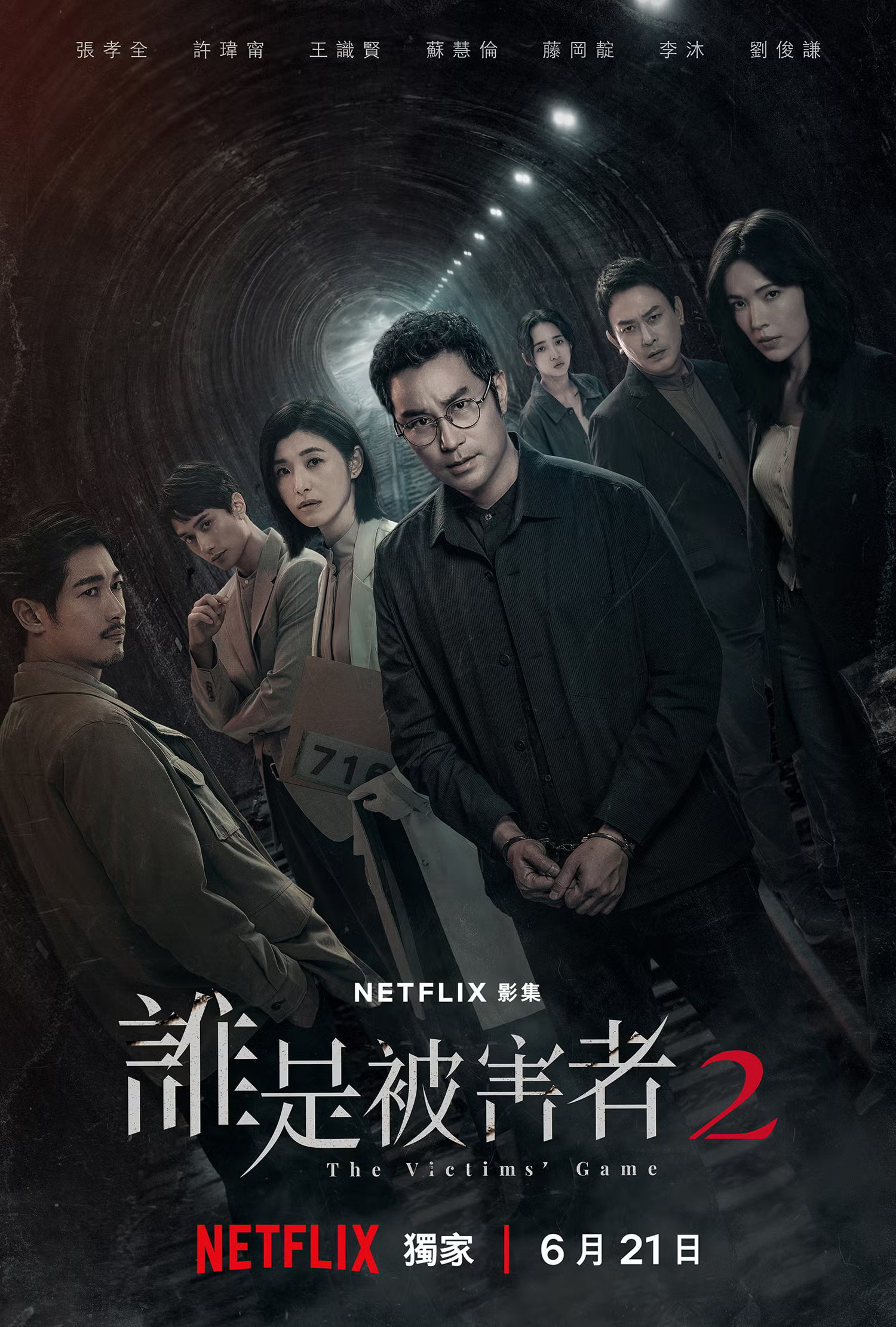
誰是被害者2
瀚草影視 / Netflix
Netflix 首部續訂第二季的原創華語影集主視覺。延續第一季的黑暗懸疑基調,以破碎鏡面與多重人物倒影構圖,暗示「每個人都可能是被害者」的核心命題。冷峻色調與高對比度強化推理氛圍。
成效數據
正港分局
金盞花大影業 / Netflix
《關於我和鬼變成家人的那件事》衍生影集主視覺。延續電影的喜劇、動作及警匪元素,以誇張的人物群像構圖展現「拐瓜劣棗」警員陣容。色彩飽和度刻意提高,強化荒謬喜劇氛圍。
成效數據
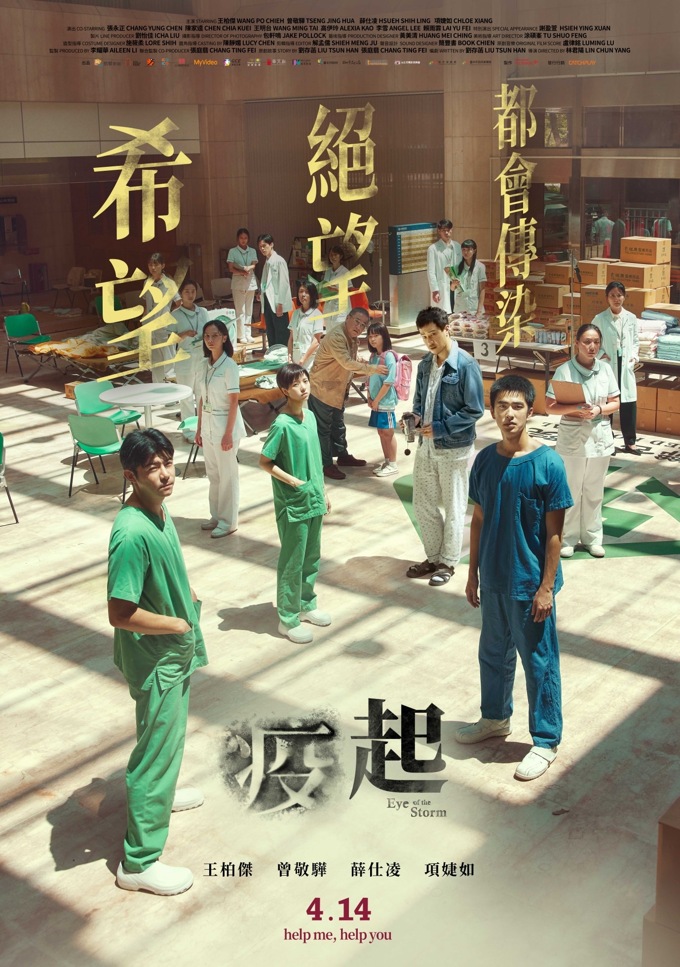
疫起
台灣電影
2003年SARS封院事件的視覺化呈現。以醫護人員的防護裝備為視覺錨點,結合壓迫性的封閉空間構圖,傳達「隔離中的人性」主題。冷色調與暖色人物形成對比,強化情感張力。
成效數據
My Boss Mark
Oxygen Films
First live-action film adaptation of the 14-year-running hit webcomic “I Am Mark.” Director Kevin Chu reunites with triple Golden Award winner Crowd Lu after 5 years, joined by Golden Melody singer YELLOW in his first major film role. A collective creative effort to revive Taiwan’s comedy genre, capturing the burnt-out office worker’s rebellious spirit.
Performance Metrics
Far End of Heaven
TSAOism / PixelFrame
Director Jui-yuan TSAO’s passion project, 17 years in the making. Won the Special Award at the inaugural Taiwan International Film and TV Project Promotion in 2006. After the director’s mother passed from cancer, the project was paused, now finally nearing completion. “The more desolate the terrain, the more courage we summon to dream.” A father-son escape journey through the wilderness. Taiwan-Australia co-production with desert and starry sky visual imagery representing loss and redemption.
Performance Metrics
Port of Lies
Mirror Fiction / Chunghwa Telecom
Key art for a legal political thriller exploring indigenous rights, migrant workers, death penalty, and corruption. Courtroom scales interwoven with fishing port imagery present the core tension of “justice vs. system.” Cold gray-blue tones create oppression, character back-facing composition implies the loneliness and persistence of fighting against the establishment.
Performance Metrics
GATAO Concert
Mani Entertainment
Key art for the GATAO film series 10th anniversary concert. Brotherhood and loyalty as core themes, fusing neon lights with tattoo aesthetics to present a unique “gangster romance” style. Red-black-gold contrast intensifies conflict, ensemble composition pays tribute to iconic film scenes.
Performance Metrics
Living
TVBS / Netflix
Key art for a heartwarming drama exploring family bonds and life’s meaning. Family ensemble with warm lighting composition presents the theme of “finding connection in finite life.” Soft tones and everyday scenes create intimacy, visual strategy lowers viewing barriers and triggers audience reflection on family relationships.
Performance Metrics
The Outlaw Doctor
PTS / iQIYI / CATCHPLAY+
Key art for a social realist drama exploring migrant workers and healthcare system struggles. Light contrast between surgical lamps and dark underground spaces presents the dual world of “above ground vs. underground.” Medical instruments interwoven with Vietnamese cultural elements convey tension between identity and survival.
Performance Metrics
Black Tide Island
Hakka TV / Hami Video
Key art for a period drama recreating Green Island’s political prison during the White Terror era. Starry sky and Kuroshio ocean as backdrop, character silhouettes standing on island rocks convey “looking up to hope in darkness.” Cold blue-black tones with subtle starlight create contrast between historical weight and human resilience.
Performance Metrics
Old Wings
Chen Xiao-Xia
Album cover design for legendary Mandopop songwriter Chen Xiao-Xia’s return after 20 years. Minimalist whitespace with hand-drawn feather imagery presents the core concept: “old wings can still fly.” Warm earth tones convey wisdom accumulated through years, composition leaves breathing room, echoing the album’s philosophy of “letting go and taking flight again.”
Performance Metrics
Tabloid
PTS / Netflix
Key art for a mystery crime drama exploring media ecology and truth-seeking. Shattered camera lens and tabloid collage composition implies the core question: “Who killed the truth?” Red-black headline style amplifies sensationalism, character silhouettes with camera flash effects create paparazzi chase tension.
Performance Metrics
K-DOL Academy
Taiwan Original
Key art for an idol training campus drama. Neon lights and stage elements composition present the competitive atmosphere where “numbers determine status.” Pink-purple palette with starlight effects precisely targets Gen-Z audience. Character ensemble arrangement implies relationship tensions, visual language fuses K-POP aesthetics with local Taiwanese youth vibe.
Performance Metrics
Born for the Spotlight
Netflix / Taiwan Mobile
Key art for a realistic comedy about actresses surviving in showbiz. Stage spotlight and mirror reflection composition implies the dual narrative of “glamour on stage vs. reality behind scenes.” Gold and black contrast symbolizes fame and its price, ensemble layout showcases female power and competitive tension.
Performance Metrics
Let's Talk About CHU
Netflix
Bold key art for a sex comedy tackling taboo topics in the Chinese-language market. Vibrant candy colors and playful illustration style dissolve awkwardness around sexual themes. Family ensemble composition implies “cross-generational dialogue,” strategically lowering psychological barriers to boost click-through rates.
Performance Metrics
Copycat Killer
Netflix
Taiwan localization of Miyuki Miyabe’s mystery novel. Set in 1990s Taiwan, the key art uses newspaper collage and VHS texture to recreate the visual language of the media chaos era. Red-black contrast implies blood and darkness, while silhouette composition builds suspense.
Performance Metrics
The Victims' Game 2
Greener Grass Production / Netflix
Key art for Netflix’s first renewed Chinese-language original series. Continuing Season 1’s dark suspense tone, the shattered mirror and multiple character reflections composition implies the core theme: “everyone could be a victim.” Cold tones and high contrast intensify the mystery atmosphere.
Performance Metrics
Copycat Killer Precinct
Greener Grass Production / Netflix
Key art for the spin-off series of “Marry My Dead Body.” Continuing the film’s comedy, action, and cop thriller elements, the exaggerated ensemble composition showcases the quirky police crew. Deliberately heightened color saturation amplifies the absurdist comedy atmosphere.
Performance Metrics
Eye of the Storm
Taiwan Film
Visual representation of the 2003 SARS hospital lockdown incident. Using medical protective gear as a visual anchor, combined with claustrophobic spatial composition, conveying the theme of “humanity in isolation.” Cold tones contrasting with warm human figures amplify emotional tension.